Explore
Pantone’s colour of the year for 2026 could be its most divisive yet
Next year’s colour is...

AI summary
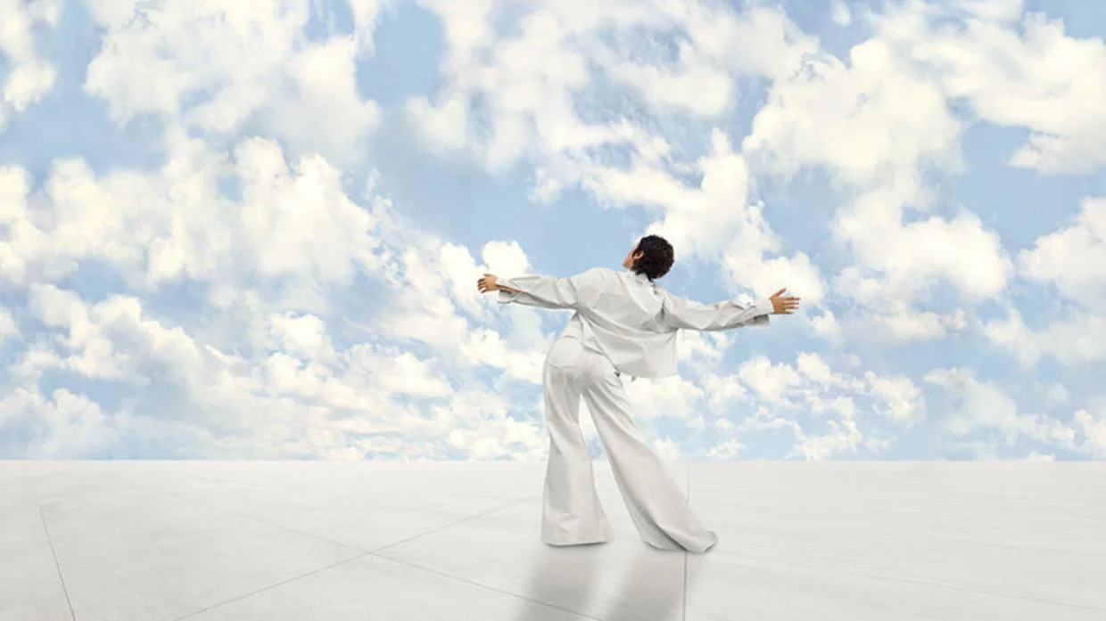
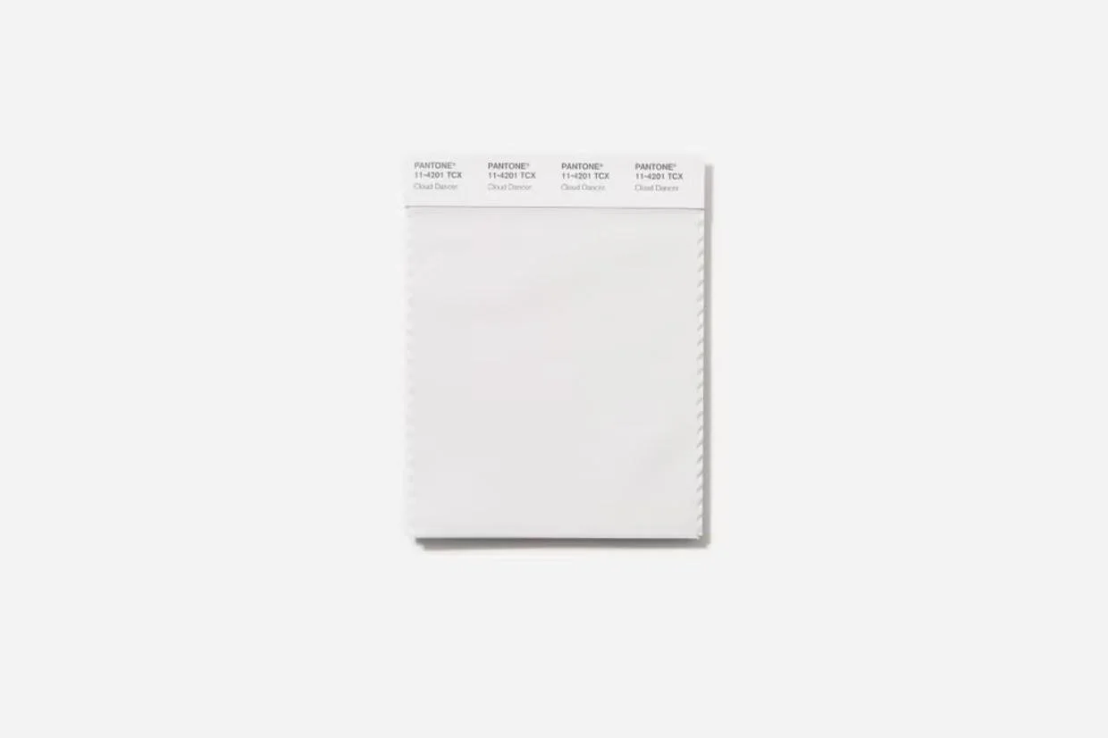
Pantone has revealed its 2026 Colour of the Year: Cloud Dancer, an ethereal white shade symbolising serenity and a "clean slate".
While praised by designers from The White Company for its calming versatility, the choice is divisive due to its impracticality and difficulty keeping clean. Experts warn that choosing the right white is complex, as undertones can make a space feel sterile. To avoid a clinical look, they recommend incorporating varied textures like wool, satin, or lace.
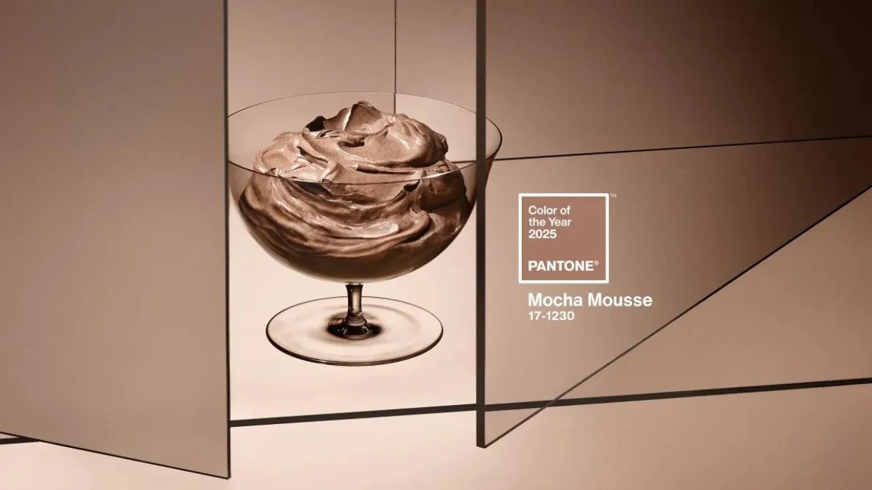
Controversial? Pantone had not chosen a brown for over a decade, before selecting Mocha Mousse for 2025.
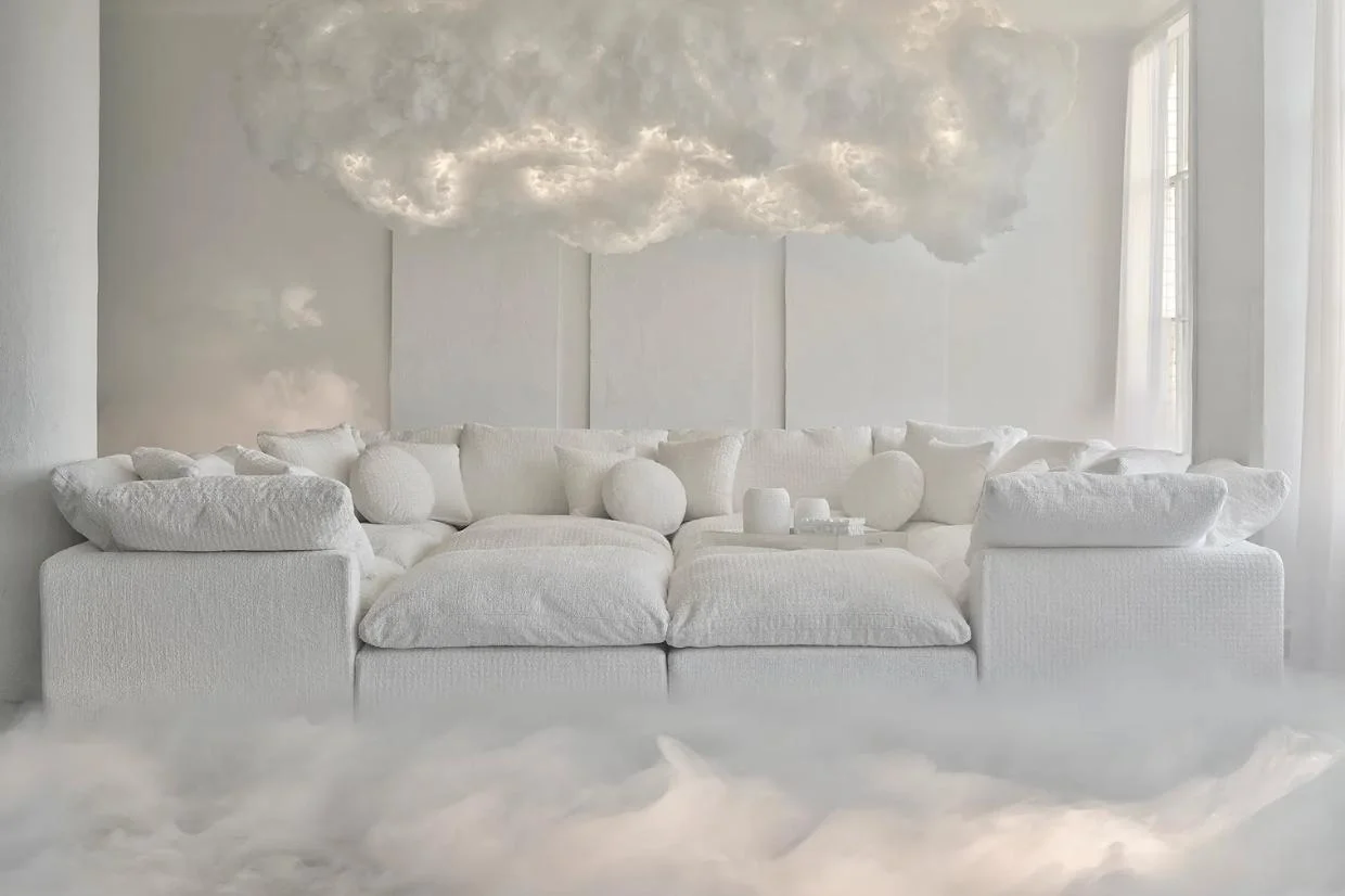
White is alright for soft furnishings (unless you have pets or children, eat food or have sweaty hands).
Ask the expert: How do I choose a white paint?
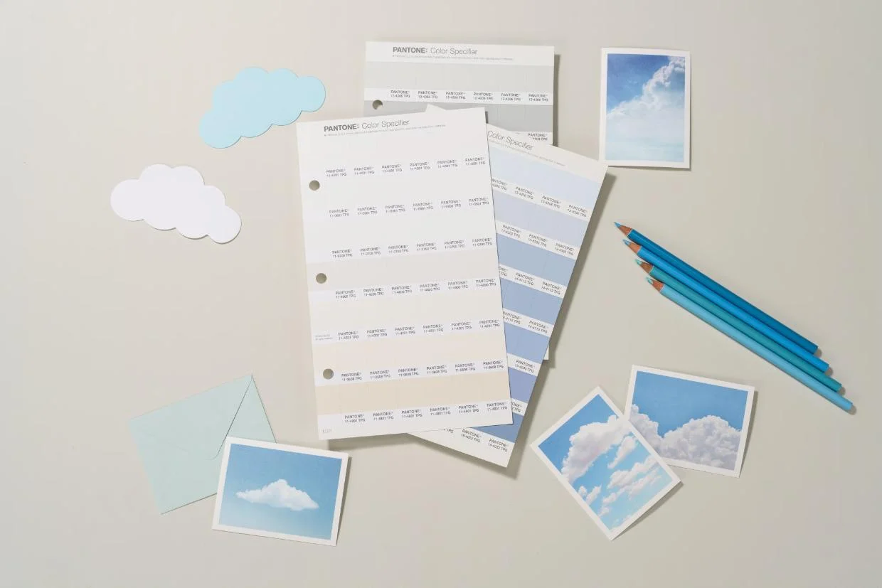
Soft pastels are a match for the kind of slightly off-white Pantone are offering for next year.
What's in a colour, after all?

Author
Discover More

First home buyers hit record highs as national property values dip -0.2%
While investors are tapping the brakes, first home buyers are accelerating.
The priciest property sales this year: Auckland and Queenstown dominate but other towns almost broke in
Explore the 10 priciest property sales of the year. Discover why Auckland and Queenstown dominate the luxury market.
Search
Other articles you might like
.png?fit=max&format=webp&quality=85)